
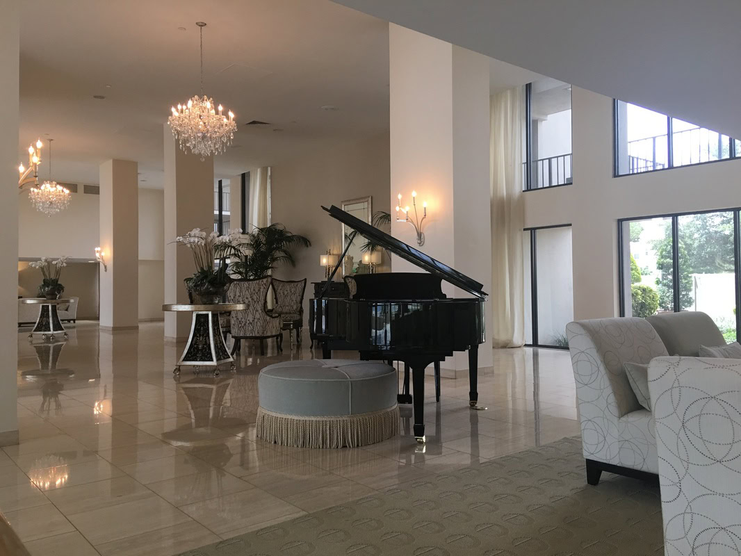

Every year brings fresh color trends, but in a market like Tampa Bay, the colors that truly work are the ones that account for our unique light, lifestyle, and architectural context. Tampa’s abundant natural sunlight, open floor plans, and indoor-outdoor living culture all influence which colors feel right on the walls — and which ones miss the mark. This guide highlights the interior paint colors that are trending nationally in 2026 and explains how they translate specifically to Tampa Bay homes.
Warm Whites Continue to Dominate
If there’s one color category that never goes out of style in Tampa, it’s warm white. The combination of Tampa’s intense sunlight and the popularity of open floor plans means that warm whites — whites with subtle yellow, cream, or pink undertones — continue to be the most requested interior color family for whole-home applications. Cool whites with blue or gray undertones can feel stark and clinical in Florida’s bright light, while warm whites feel inviting and luminous.
For 2026, the standout warm whites include Sherwin-Williams Alabaster (SW 7008), which has been a Tampa favorite for years and shows no signs of fading in popularity. Benjamin Moore White Dove (OC-17) offers a slightly creamier warmth that works beautifully with natural wood tones and stone. Sherwin-Williams Pure White (SW 7005) provides a brighter, cleaner warm white for homeowners who want maximum light reflection without the coldness of a true bright white.
Soft Sage and Earthy Greens
The biggest color story of 2026 is the continued rise of green — specifically the soft, muted sage and olive tones that connect interior spaces to the natural world outside. In Tampa, where lush tropical landscaping is visible through nearly every window, sage greens feel like a natural extension of the outdoor environment.
Sherwin-Williams Evergreen Fog (SW 9130), their 2022 Color of the Year, remains enormously popular in Tampa homes and continues to feel fresh and relevant heading into 2026. Benjamin Moore October Mist (1495), their 2022 selection, is a softer, lighter sage that works well in bedrooms and bathrooms. For a deeper, richer green, Sherwin-Williams Retreat (SW 6207) delivers an earthy olive tone that creates a grounding, sophisticated accent wall.
Green works particularly well in Tampa homes because it complements the warm tones of natural wood, stone, and tile that are common in Florida interiors. It pairs beautifully with both warm white and greige trim colors, and it reads as calm and organic in Tampa’s bright natural light.
Rich Blues and Navy Accents
Deep blues have been a strong accent color for several years, and they remain a powerful choice in 2026 for creating focal points in specific rooms. Navy and midnight blue accent walls in bedrooms, home offices, and dining rooms create a dramatic contrast against lighter walls and ceilings that makes spaces feel both sophisticated and cozy.
Sherwin-Williams Naval (SW 6244), their 2020 Color of the Year, continues to be the most requested deep blue in our portfolio. Benjamin Moore Hale Navy (HC-154) is equally popular and offers a slightly more traditional, colonial feel. For a softer approach to blue, Sherwin-Williams Debonair (SW 9139) provides a moody, dusty blue that works as a whole-room color rather than just an accent.
In Tampa’s bright light, dark blues work best in rooms with controlled lighting or northern exposure where the color retains its depth. In south-facing rooms with intense sunlight, navy can appear washed out or lighter than expected, so viewing large samples in the actual room is especially important with dark colors.
Warm Neutrals and Greige
The greige family — the versatile middle ground between gray and beige — continues to be a go-to neutral for Tampa homeowners who want something more contemporary than traditional beige but warmer than cool gray. Greige tones work with virtually any decor style and pair well with the warm wood-look tile and luxury vinyl plank flooring that dominates Tampa home interiors.
Sherwin-Williams Agreeable Gray (SW 7029) remains the single most popular wall color in the Tampa market for whole-home applications. It reads as a true neutral that shifts slightly warm or cool depending on the light, making it incredibly versatile. Benjamin Moore Revere Pewter (HC-172) is a slightly warmer alternative with more beige undertone, and Sherwin-Williams Accessible Beige (SW 7036) provides a warmer, sandier option for homeowners who prefer a distinctly warm neutral over a balanced greige.
Warm Earth Tones: Terracotta and Clay
New for 2026, warm earth tones inspired by terracotta, clay, and desert landscapes are making a statement in Tampa interiors. These rich, warm pigments bring a sense of groundedness and organic warmth that contrasts beautifully with the crisp whites and cool grays that have dominated for the past decade.
Sherwin-Williams Cavern Clay (SW 7701), their 2019 Color of the Year, is experiencing a resurgence as homeowners seek warmer, more personality-driven accent colors. Benjamin Moore Terra Cotta (AF-245) provides a slightly more muted, sophisticated take on the trend. These colors work best as accent walls, powder room treatments, or dining room statements rather than whole-home applications, and they pair beautifully with natural wood, woven textures, and the warm neutral palettes already popular in Tampa homes.
Color Flow in Open Floor Plans
Most Tampa homes built in the last 20 years feature open floor plans where the kitchen, family room, and dining area share a single continuous space. This layout requires a thoughtful approach to color — you can’t simply pick a different color for each room without creating visual chaos.
The most successful approach for open floor plans is to select a single cohesive color for the main living space — typically a warm white, greige, or soft neutral — and reserve bolder colors for enclosed rooms like bedrooms, bathrooms, home offices, and dining rooms. This creates a unified backdrop in the main living areas while allowing personal expression in private spaces. Transitional areas like hallways and foyers should use the same color as the main living space to maintain flow.
Accent color can be introduced in open floor plans through a kitchen island in a contrasting cabinet color, a feature wall behind a fireplace or entertainment center, or coordinated accessories and textiles that bring pops of sage, navy, or terracotta into the neutral background.
Florida-Specific Color Advice
Before finalizing any interior color for your Tampa home, remember that Florida’s natural light is dramatically more intense than in northern states. Colors will appear lighter and more washed out in direct sunlight, so choosing a shade one step darker than what looks right on the paint chip often produces the best result on the wall. View large samples in your actual rooms at morning, midday, and evening to see how the color shifts throughout the day. And always consider how the color looks alongside your fixed finishes — your flooring, countertops, and tile are not changing, so the paint must coordinate with what’s already there.
Ready to Refresh Your Tampa Home’s Interior?
Let Enos Executive Painting help you choose the perfect colors for your home. Call (813) 907-5444 or request your free estimate online. Our color consultation service is included with every painting project.