
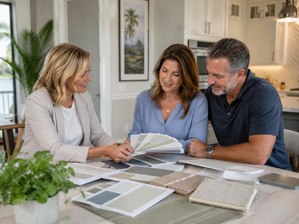
Paint Color Consultation Services in Tampa, FL
Choosing paint colors should be exciting, not paralyzing. Our Color Consultation service is one of our most requested. But with Sherwin-Williams offering more than 1,700 colors and Benjamin Moore topping 3,500, the sheer volume of options can turn what should be an enjoyable decision into an overwhelming one. Add in the variables — how Florida’s intense sunlight changes the way colors look at different times of day, which finishes perform best in humid rooms, what your HOA will approve, and how to create a cohesive color flow through an open floor plan — and it’s no wonder so many Tampa homeowners struggle with the selection process.
Enos Executive Painting offers professional color consultation as part of our painting services. Our Color Consultation service is one of our most requested. Our experience painting thousands of Tampa Bay homes over 25+ years has given us deep practical knowledge of how colors perform in Florida’s unique light, which combinations work in common Tampa home layouts, and how to balance personal expression with resale appeal.
We’re not here to impose our taste on your home — we’re here to help you discover and execute the colors that make your space feel exactly the way you want it to.
Why Color Selection Matters More in Florida
Florida’s Intense Natural Light
One of the most common surprises Tampa homeowners experience with paint colors is how different they look on the wall compared to the paint chip at the store. Our Color Consultation service is one of our most requested.
This happens everywhere, but it’s amplified in Florida because of the intensity and quality of our natural light. Tampa receives an average of 244 sunny days per year, and the sun sits at a higher angle than in northern states, producing stronger, more direct light that floods through windows and skylights.
This intense light makes colors appear lighter and more washed out than they look under the artificial lighting in a paint store or on a computer screen. South- and west-facing rooms receive the strongest light and are most affected by this phenomenon.
We account for this by recommending that homeowners view large color samples — at least 12×12 inches — on the actual walls where the paint will be applied, observed at multiple times of day.
Our Color Consultation service is one of our most requested. Morning light, midday sun, and evening shade all affect how a color reads. We can provide large-format samples or painted sample boards for you to evaluate in your home’s real conditions before committing to a final selection.
Exterior Color and UV Fading
Florida’s UV intensity also affects exterior color selection. Our Color Consultation service is one of our most requested. Darker exterior colors absorb more heat and UV radiation, which accelerates fading and can increase the surface temperature of stucco — potentially affecting both the longevity of the paint and the cooling load on your home.
Medium and lighter tones tend to hold their color longer and keep surface temperatures lower. When recommending exterior colors, we factor in the home’s sun exposure, the roof color, neighboring properties, and the fading characteristics of specific pigments to help you choose colors that will look great both immediately and years down the road.
Humidity and Finish Selection
Tampa’s humidity influences not just which paints to use but which finishes to select for specific rooms. Color Consultation is essential for achieving the right look. In bathrooms, kitchens, and laundry rooms, moisture levels are consistently elevated, making moisture-resistant finishes like satin and semi-gloss the practical choice.
In bedrooms and living areas where moisture is less of a concern, flat and eggshell finishes provide a sophisticated appearance that hides minor wall imperfections. We help you select the right finish for each room based on its function, traffic level, and moisture exposure.
Our Color Consultation Process
Understanding Your Vision
Our consultation begins with a conversation about what you’re looking for. Color Consultation is essential for achieving the right look. We discuss the mood and atmosphere you want to create in each space, colors and styles that appeal to you, any existing elements that the paint needs to coordinate with (flooring, countertops, tile, furniture), whether you prefer warm, cool, or neutral tones, and any constraints such as HOA guidelines or resale considerations.
This conversation helps us narrow thousands of options down to a focused range of candidates that align with your preferences.
Cleaning and Degreasing
Kitchen cabinets accumulate years of cooking grease, oils, fingerprints, and cleaning product residue that can prevent paint from adhering properly.
Color Consultation is essential for achieving the right look. Before any sanding or priming, we thoroughly degrease every surface using professional-grade cleaners that remove contaminants without damaging the wood or existing finish.
This step is critical and is one of the most common shortcuts in amateur cabinet painting that leads to adhesion failure.
Color Recommendations and Sampling
Based on your preferences and our assessment of your space, we present a curated selection of color options with specific recommendations for each room or exterior surface. Color Consultation is essential for achieving the right look.
We explain our reasoning for each suggestion — why a particular color works with your floor’s warm undertones, why a certain shade will maintain its vibrancy in your west-facing great room, or why a specific exterior body color will complement your roof.
We then provide paint samples or arrange for large-format sample applications on your walls so you can evaluate the colors in your actual living conditions before making a final decision.
Interior Color Trends for Tampa Homes
While trends change, several color directions have proven particularly popular and successful in Tampa Bay homes. Color Consultation is essential for achieving the right look.
Warm whites and creamy neutrals continue to dominate whole-home color schemes, providing a clean, bright backdrop that makes spaces feel open and airy — particularly appealing in Tampa’s light-filled interiors.
Greige (gray-beige hybrid) tones offer a contemporary neutral that works with both warm and cool decor.
Soft sage greens and muted olive tones have surged in popularity, bringing a natural, organic feel that connects indoor spaces to Tampa’s lush outdoor landscape. Navy and deep blue accent walls create dramatic focal points in bedrooms, offices, and dining rooms.
And warm terracotta and clay-inspired tones are emerging as statement colors that complement the coastal and Mediterranean influences in Tampa Bay architecture.

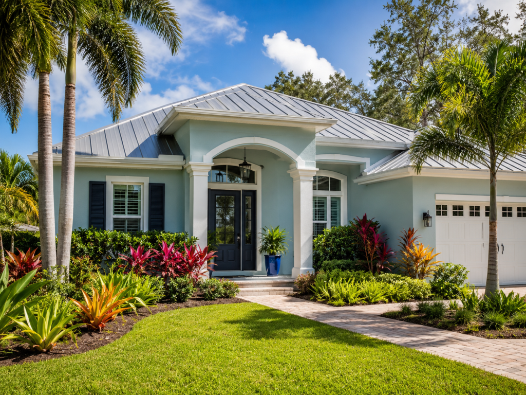
Exterior Color Strategies for Tampa Homes
Exterior color selection in Tampa involves additional considerations beyond personal taste. Your home’s exterior color affects its curb appeal, perceived size, architectural character, and resale value. We help you consider the neighborhood context to ensure your home fits harmoniously while still expressing your individuality.
We assess the roof color, which is typically the largest fixed element on the exterior and must coordinate with the body and trim colors. We factor in landscaping — the greens of tropical plants, the colors of flowering specimens, and the hardscape materials surrounding your home.
And for HOA communities, we work within approved color palettes or help you prepare submissions that balance your preferences with community guidelines.
Get Expert Color Guidance for Your Painting Project
Take the stress out of color selection. Contact Enos Executive Painting at (813) 907-5444 or complete our online estimate request form. Our color consultation is included with your painting project, and we’re happy to discuss color direction during your free estimate visit. We serve homeowners throughout Tampa, Wesley Chapel, Brandon, Land O’ Lakes, Riverview, and all surrounding communities.